Templating the app investiment journey
Problem statement
There were significant differences between the trading experiences offered by the various investment products available on the XP app, and the investment funds team accepted the challenge of creating a templated journey that would cater to all the investment products we currently offer to our clients.
Direct objectives
Ensure consistency, standardize behavior, reduce cognitive load, ensure accessibility with an equivalent experience for everyone.
Indirect objectives
Increase conversion, reduce contact rate, improve CSAT/NPS.
Project stages
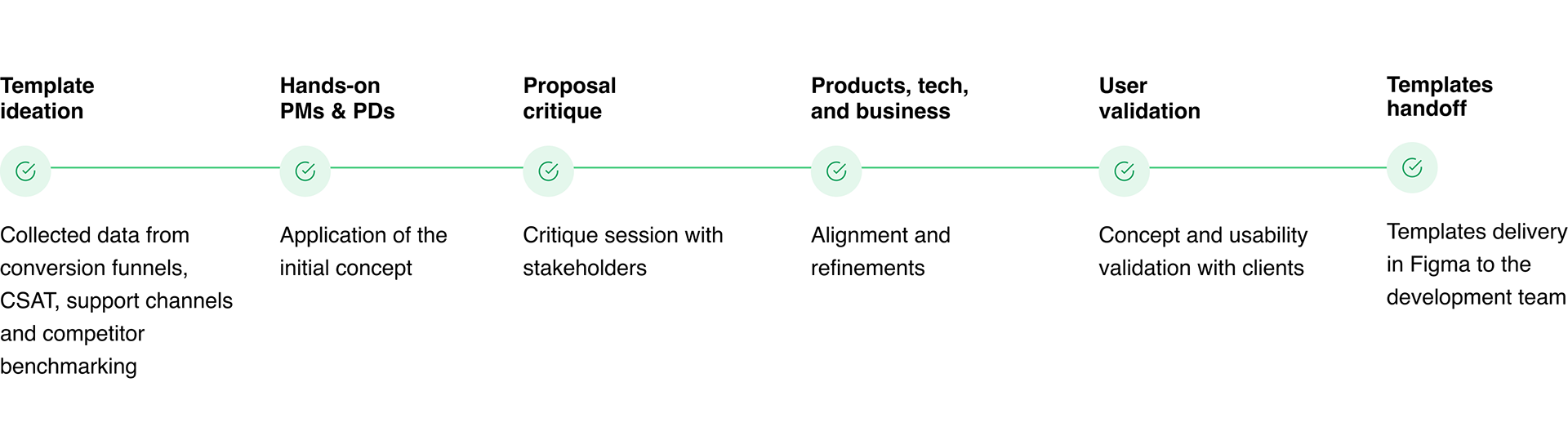
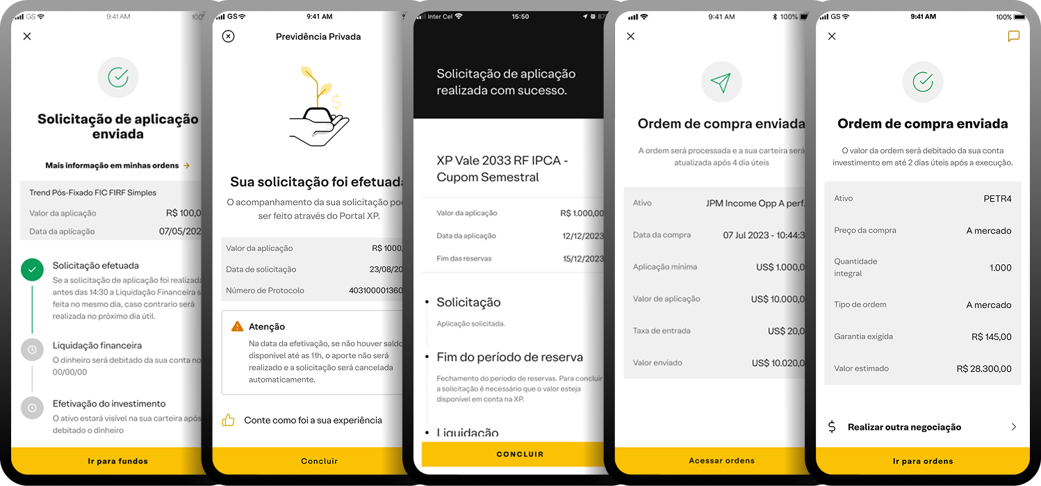
Mapping 'as is'
Order ticket UI
Flow step: Trading, subscription or redemption, scheduling
User goal: Define the amount they want to invest or redeem from the investment
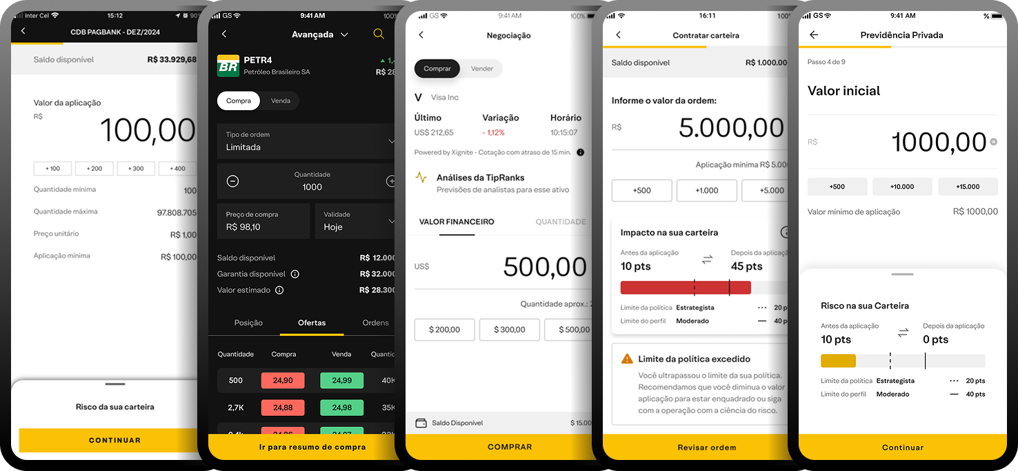
Support screen UI
Flow step: Pre and post-trade, instruction, selection, etc (used in some contexts)
User goal: Set information that affects the flow, for example, modality and affiliation
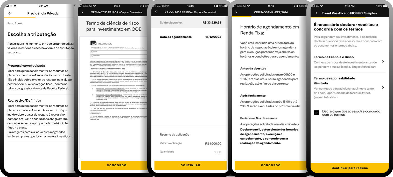
Transaction summary UI
Flow step: Info confirmation, consent agreement and authentication
User goal: Check the amount, terms and other details. Also, confirm the transaction via a security method
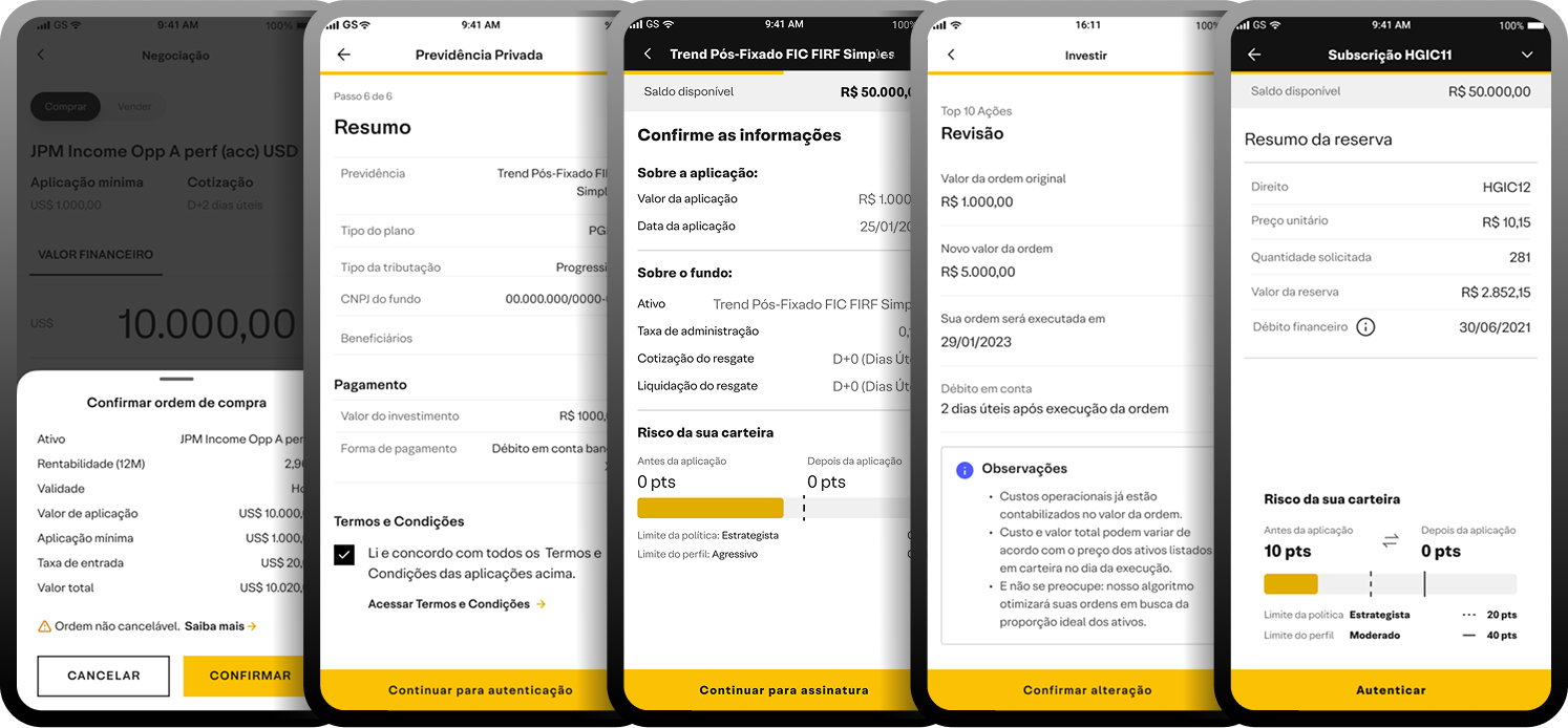
Feedback UI
Flow step: Success, timeline, and additional information
User goal: Ensure that my investment was completed and review the schedule for subscription or redemption
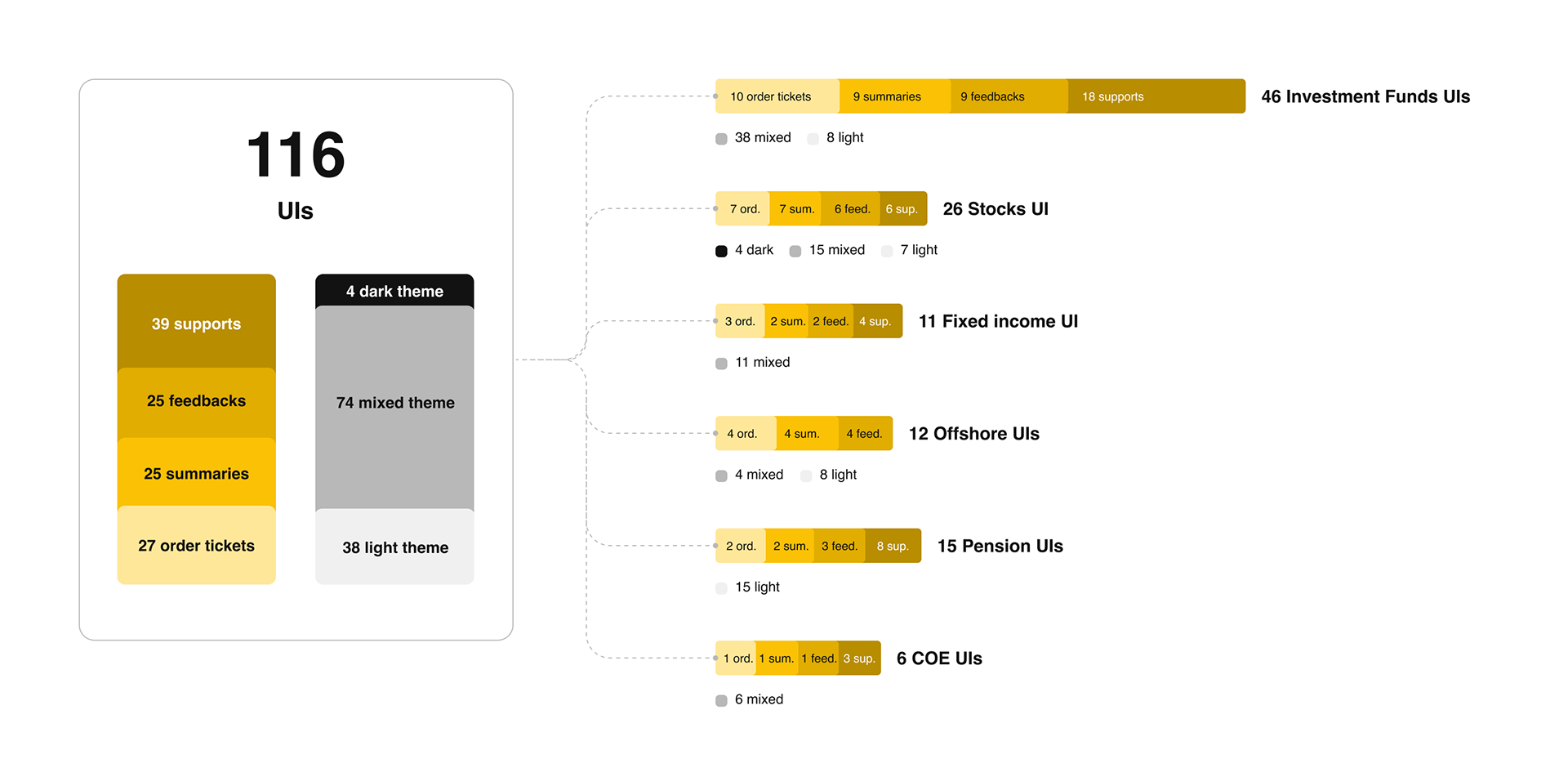
Mapped inconsistency volume
Total of 6 products with 17 different trading flows
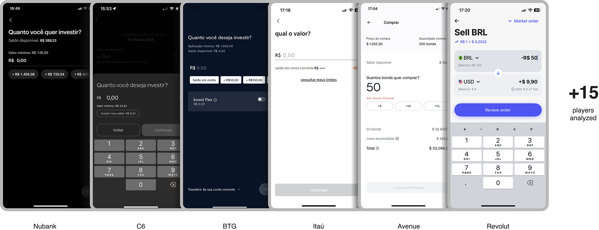
Benchmark and data
We looked at existing data in our databases and analyzed the market
Hands-on and Critiques
We tested with the product teams how the concept fit within each product's flow, followed by refinement feedback

Usability testing
+ 2.000 clients validated the new journey
We refined the concept based on insights from critiques to validate if:
• Information was clear and relevant
• Scheduling was intuitive
• There was an impact with dark mode
• Users prefered to trade by quantity or value (closed-end funds and treasury direct)
• The choice between buy and sell was intuitive (stocks)
• The method for choosing price or order type has an impact (stocks)
Results
4.3 out of 5
SUM score (test performed using Maze)
👉 The main task was successfully completed across all products!
👉 Stocks were removed from the scope - the customer profile and behavior are quite different from other products and we understood that it didn’t make sense to ‘compromise’ the experience to include their product in the templating journey
👉 The option to choose between quantity or value was kept, both worked well
👉 Information and terms were refined, with added tooltips for even more clarity
👉 We simplified the acceptance of terms as part of the summary
Handoff
100% aligned documentation between design and dev team
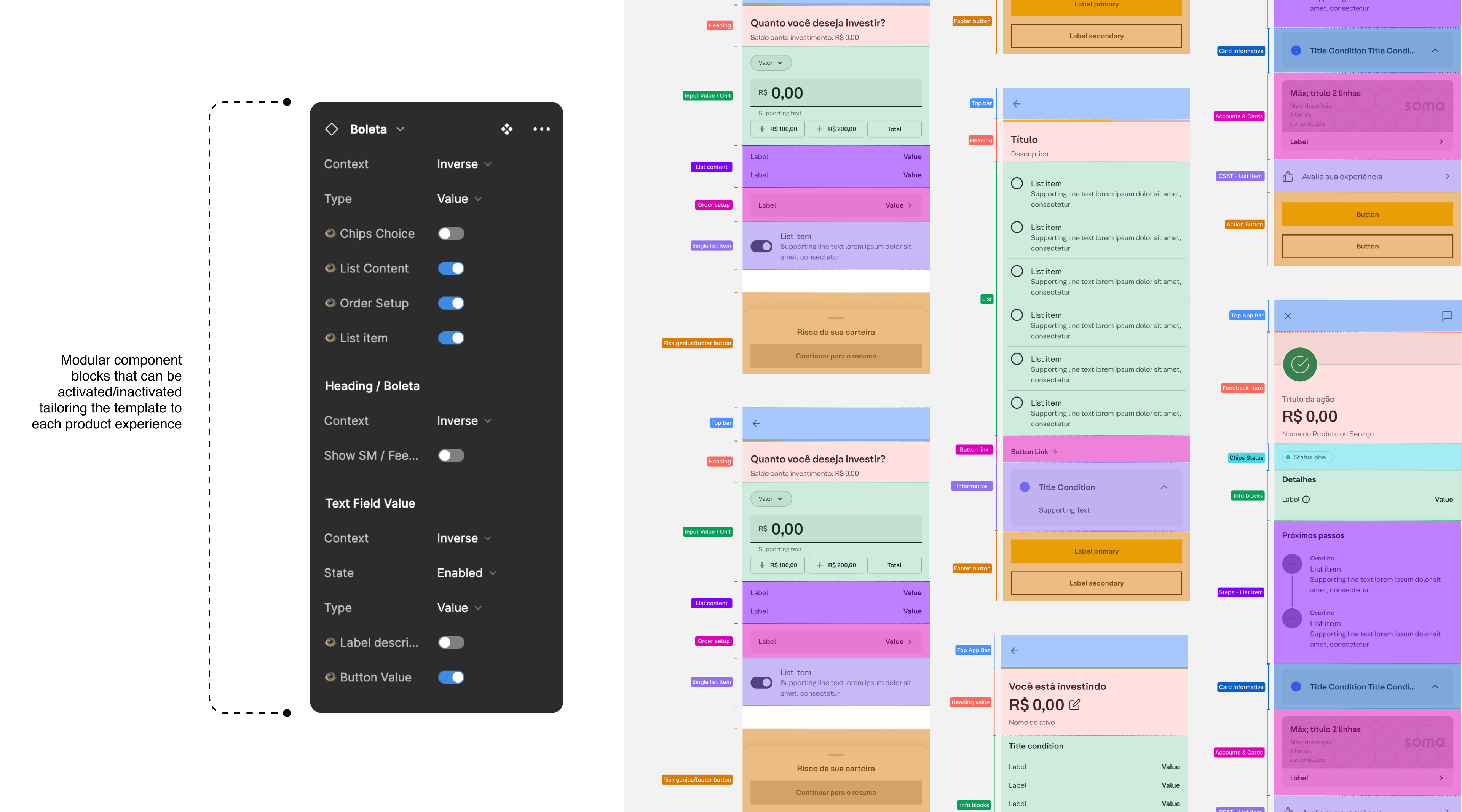
Deliverables

Outcomes
↑10.5%
Task completion
The redesign led to a 10.5% increase in conversion rates, with the completion rate rising from 68.69% to 75.9%
↑ 9.3%
Significant progress in customer satisfaction
The CSAT score improved by 9.3%, going from 4.3 to 4.7
6 to 3 steps
Streamlining the journey
Cutting down the number of steps with a complete redesign of the investment funds journey, making the process faster and more intuitive for users
from 62s to 29s
Reduction in task completion time
The improved journey reduced completion time from 62 seconds to just 29 seconds, delivering a faster and more efficient experience
✋ This new journey was launched for our clients at the end of 2024 and we are already working on improvements based on evaluations and tagging data, in a cyclical manner, evolving the investment journey each sprint.
For now that's all, folks!